
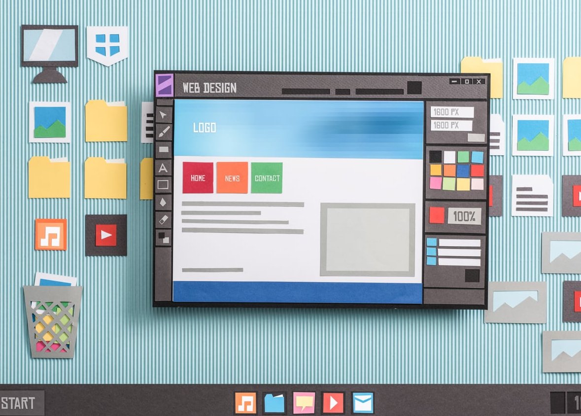
What Is Card Based Website Design?
Card based website design is a layout approach that organizes content into rectangular containers, called cards, each holding a single, self-contained piece of information. Think of physical playing cards: each one stands on its own, can be rearranged, and is instantly scannable. On the web, cards typically combine an image, a title, a short description, and sometimes a call-to-action, all wrapped inside a bordered or shadowed container.
This pattern has become a foundational element of modern UI because it mirrors how users actually consume content online: in quick, digestible chunks. Whether you are browsing Pinterest, scrolling Netflix, or shopping on a PrestaShop store, you are interacting with cards.
Why Card Layouts Work So Well
Cards solve several UX challenges at once. Here is why designers keep coming back to them:
- Scannability: Each card is a complete unit, so users can quickly evaluate content without reading paragraphs.
- Modularity: Cards can be rearranged, added, or removed without breaking the layout.
- Responsive friendliness: They naturally reflow from multi-column grids on desktop to single-column stacks on mobile.
- Visual hierarchy: Borders, shadows, and spacing create clear boundaries between pieces of content.
- Action-oriented: Each card can carry its own buttons or links, turning content into interactive entry points.
The Core Anatomy of a Card
Before designing, it helps to understand the standard ingredients of a well-built card:
- Media area: An image, video thumbnail, or icon at the top.
- Title: A clear, concise heading that summarizes the card’s content.
- Body text: A short description, usually two to four lines.
- Metadata: Optional details like dates, ratings, prices, or tags.
- Action element: A button, link, or the entire card surface acting as a clickable area.
Sizing: Getting the Proportions Right
Card sizing is where many designs go wrong. Cards that are too small feel cramped; cards that are too large lose the benefit of scannability.
Recommended Card Dimensions
| Card Type | Width Range | Best Use Case |
|---|---|---|
| Compact | 200 to 280 px | Product grids, image galleries |
| Standard | 300 to 380 px | Blog posts, articles, services |
| Wide | 400 to 600 px | Featured content, dashboards |
| Full-width | 100% of container | Mobile views, list layouts |
Aim for a consistent aspect ratio across cards in the same grid. The 3:2 or 4:3 ratio for media areas tends to feel balanced.

Spacing: The Secret to a Clean Card Grid
Spacing inside and between cards matters as much as the cards themselves. Tight spacing makes the page feel cluttered; excessive spacing breaks visual grouping.
- Internal padding: 16 px to 24 px is a safe range for most card content.
- Gutter (gap between cards): 16 px to 32 px works well on desktop. Reduce to 8 px to 16 px on mobile.
- Vertical rhythm: Keep consistent spacing between the image, title, body, and action button. A 4 px or 8 px base unit helps.
- Outer margin: Leave breathing room around the entire card grid so it does not touch the viewport edges.
Hover Effects That Actually Add Value
Hover states transform passive cards into interactive elements. The goal is to communicate clickability without being distracting.
Effects that work well:
- Subtle elevation: Increase the box-shadow on hover to give a lift effect.
- Slight scale: A transform of scale(1.02) feels responsive without being jumpy.
- Border color shift: Highlight the card border with your brand color.
- Image zoom: Slowly scale the image inside its container while keeping the card itself static.
- Reveal action: Show a hidden button or icon that was not visible at rest.
Effects to avoid: aggressive rotations, flips, or animations longer than 300 ms. They feel slow and gimmicky.
Responsive Behavior: Cards on Every Screen
Cards shine on responsive designs because they adapt naturally. The trick is to plan breakpoints intentionally.
A Practical Breakpoint Strategy
| Screen Width | Columns | Notes |
|---|---|---|
| Under 600 px | 1 | Stacked, full-width cards |
| 600 to 900 px | 2 | Tablet portrait |
| 900 to 1200 px | 3 | Tablet landscape, small laptops |
| Above 1200 px | 4 or more | Desktop displays |
Use CSS Grid with repeat(auto-fill, minmax(280px, 1fr)) for an effortless, fluid layout that adapts without media queries.
Real-World Examples That Nail Card Design
The best way to learn is by studying sites that already do it well:
- Pinterest: The original masonry card grid. Variable card heights create a visually rich, organic flow.
- Airbnb: Uses photo-forward cards with minimal text, ratings, and price. Hovering shows additional images.
- Netflix: Horizontal card carousels with hover-to-expand previews. Cards are the entire navigation.
- Trello: Cards as the actual product. Drag-and-drop card behavior shows how interactive cards can be.
- Dribbble: Uniform card grid focused on visual content with light metadata underneath.
- Medium: Article cards combining a thumbnail, title, author, and read time for fast scanning.

Best Practices for Card Based Web Design
- Stay consistent: Use the same structure across cards in the same grid. Mixing layouts breaks the rhythm.
- Limit the elements: Each card should answer one question. Avoid stuffing too much content.
- Make the entire card clickable: If a card represents a single destination, the whole surface should respond, not just the button.
- Use real content during design: Lorem ipsum hides issues with long titles or oversized images.
- Respect the grid: Cards should align to a clear column system. Floating cards feel chaotic.
- Optimize images: Use modern formats like WebP or AVIF and lazy-load offscreen cards.
- Test on touch: Hover effects do not exist on mobile. Make sure the static state communicates clickability.
Common Mistakes to Avoid
- Inconsistent card heights caused by varying body text lengths. Use line-clamping or set a fixed minimum height.
- Too many borders and shadows stacked together. Pick one visual boundary, not three.
- Tiny tap targets on mobile. Buttons inside cards should be at least 44 px tall.
- Overusing cards for content that does not benefit from them, like long-form articles or step-by-step guides.
- Ignoring accessibility: Cards used as buttons need proper ARIA roles and keyboard focus states.
Card Design and PrestaShop Stores
For e-commerce, cards are the natural format for product listings. A well-designed product card includes the image, name, price, rating, a quick wishlist or add-to-cart action, and possibly a badge for promotions or stock status. Keep them lightweight: a product grid with 24 cards should still load fast and feel snappy on mobile. Investing in clean card design directly impacts conversion rates because it makes browsing effortless.
FAQ
Is card based design still relevant in 2026?
Yes. Cards remain one of the most flexible and user-friendly layout patterns. They have evolved with trends like glassmorphism, soft shadows, and AI-driven personalization, but the core principle of grouping content into scannable units is timeless.
When should I not use cards?
Avoid cards for linear, sequential content like long articles, tutorials, or checkout flows. Cards work best when users need to compare or choose between multiple equivalent options.
What is the ideal number of cards per row?
On desktop, three to four cards per row is the sweet spot. More than five tends to make cards too small to be useful, while fewer than three wastes horizontal space.
Should every card be clickable?
Not necessarily. Informational cards (like dashboard stats) often do not need to be. But if a card leads to a detail page, make the whole surface clickable for easier interaction.
How do I keep card heights equal when content varies?
Use CSS Grid or Flexbox with align-items: stretch, then apply line-clamp on text fields to truncate long descriptions. This keeps the grid clean without manual tweaks.
Are cards good for SEO?
Cards themselves are neutral for SEO. What matters is the underlying HTML: use semantic tags, real headings, alt text on images, and proper internal links. A well-structured card grid is just as crawlable as any other layout.